UX / UI , Product Design
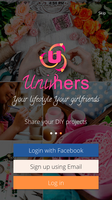
Univhers is a social community for women

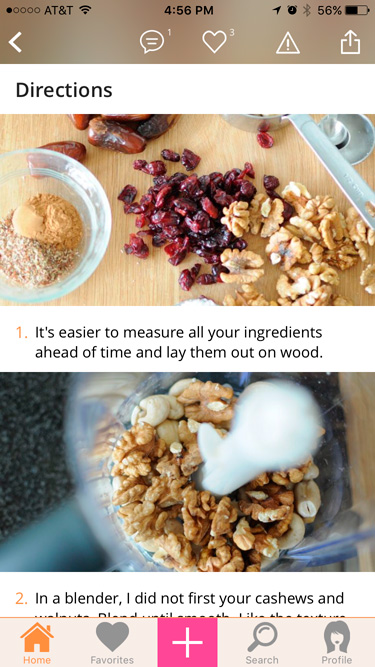
Univhers is a social community for women; making it easy to self publish your own lifestyle content. It helps the user to easily share recipes or DIY projects with photos, directions and all the details to anyone.
I was responsible for taking the idea of the Univhers and designing a coherent and engaging experience for the user. I prioritized and negotiated features for the minimum viable product and beyond. I designed the Univhers iOS App, Website , Social Media content and other promotional material. I was also responsible for co-ordinating with the development team.
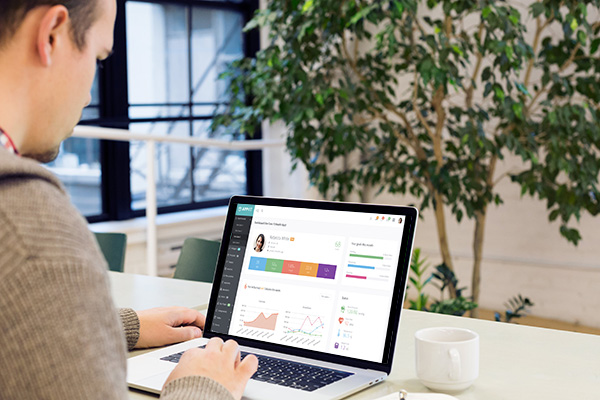
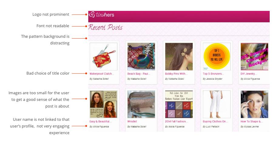
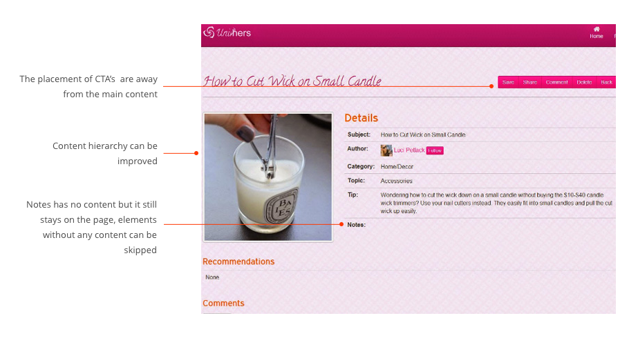
The initial Univhers solution was web based. The main problem was users were not posting new content and were not spending a lot of time on the website. The user feedback and analytics showed that most of the users were trying to use the website from a mobile device. The website was not responsive and not mobile friendly. Here are some of the screenshots of the old website highlighting the challenges. I had to design the Univhers App keeping in mind the existing features and the user pain points.
The biggest challenge was to define the scope for the minimum viable product. There were so many features that would engage the users and picking the features for the minimum viable product was a big challenge. We had to also keep the development bugdet and the business requirements in mind. The next challenge was to create a simple interface so it was not overwhelming. We went through multiple iterations to design a simple and usable interface for the users.
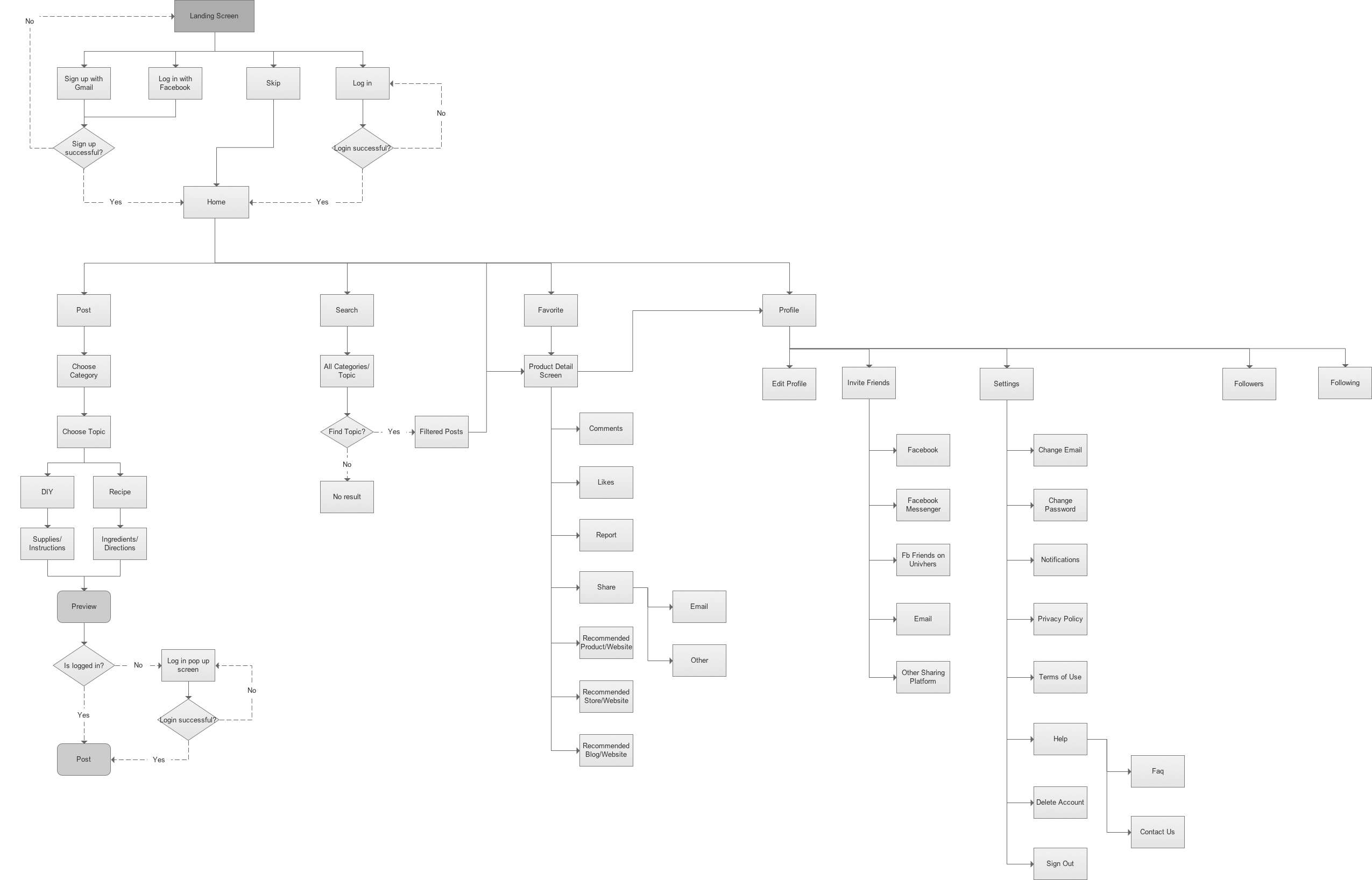
The process that I followed for this project was analyzing the existing Univhers website, competing solutions and user feedback. We had numerous sessions with entire team to brainstorm the features that we can keep and adding new features, which can enhance the user experience. Next step was to define navigation and for this we did card sorting with team and some friends. And then I created flow diagram, wireframes, prototypes and visual design for the App.
The flow diagram shows the different path that the user could take while using the application. It is mainly focussed on the primary tasks performed by any user.
With all the information gathered, we started the ideation process by sketching different options. I iterated over the sketches every week, and updated them so as to have quick feedback from stakeholders and users.
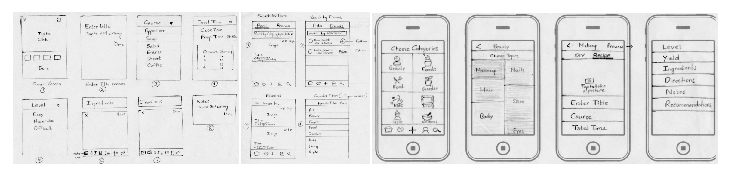
Once we had a mature structure of the application, we moved into creating the wireframes. These low fidelity wireframes helped show the client a visual representation of the complex structure of the application and most importantly, how the user will interact with it.
Based on the initial user testing and other feeback we came up with two main options:
OPTION 1 - card style layout in the home screen and tabbed approach for the detail screen.
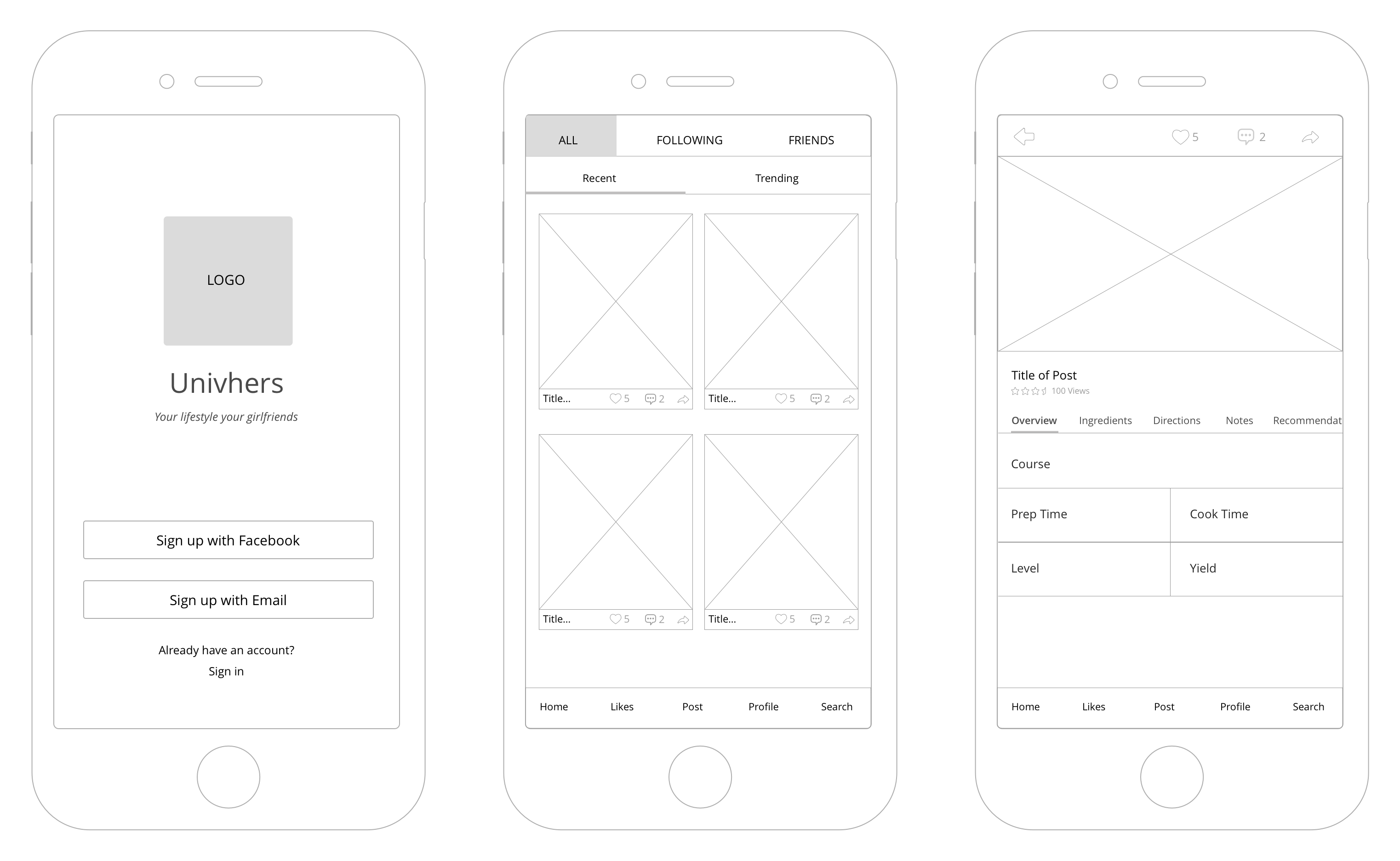
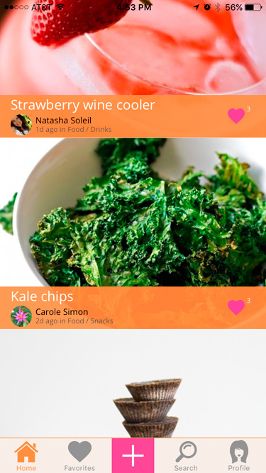
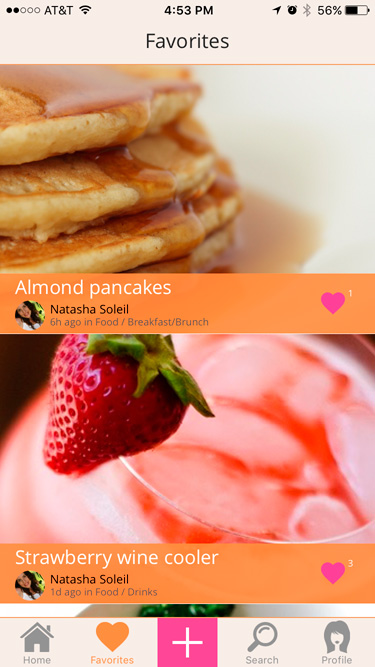
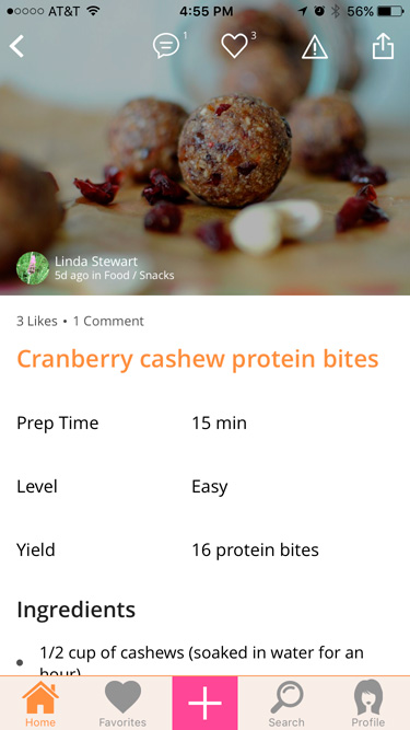
OPTION 2 (Winner) - full screen layout in the home screen and vertical scrolling approach for the detail screen.
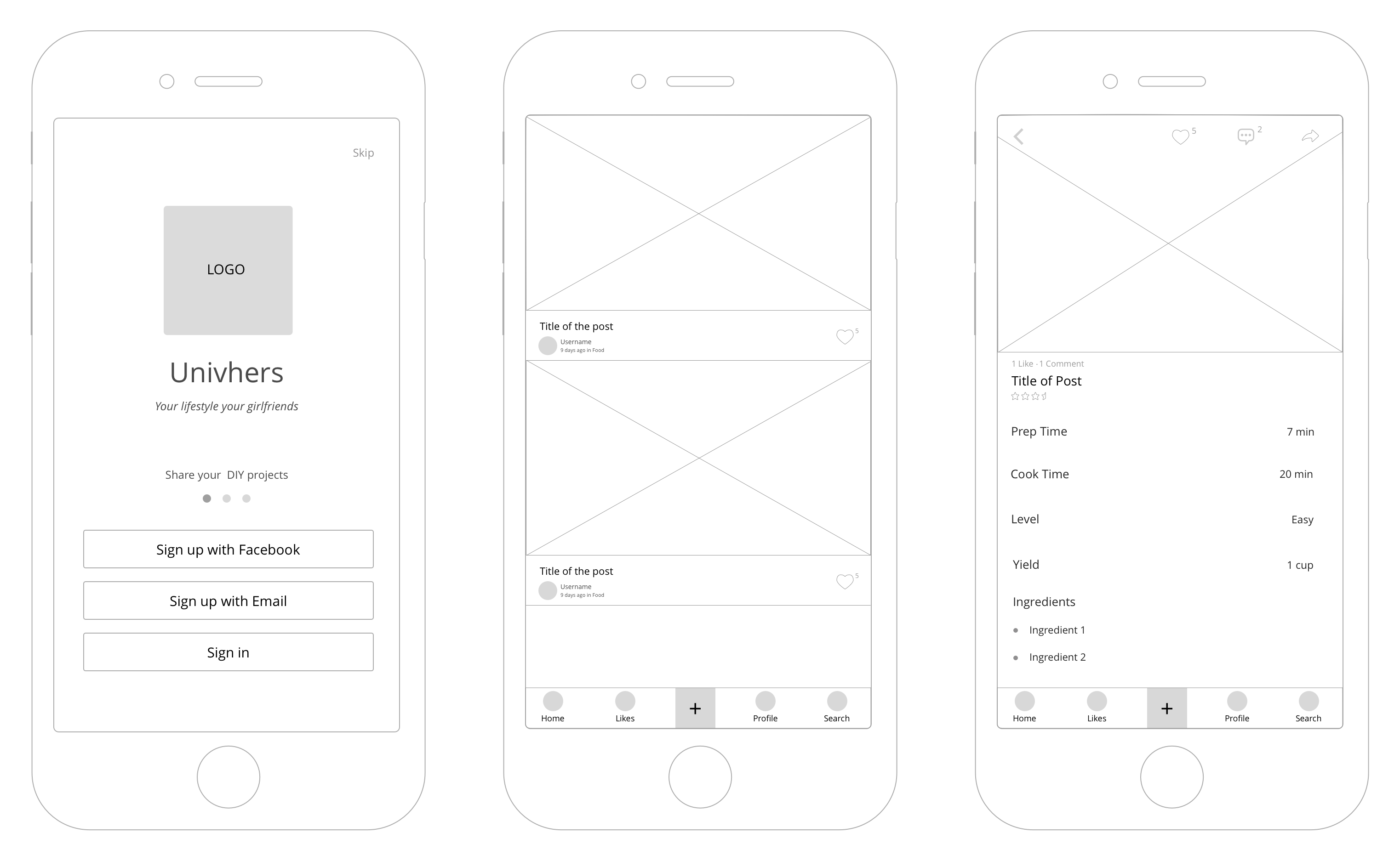
We did some testing with the users and the stakeholders and finalized to build on the option 2 as it had a very simple design and easy to use for anyone. The option 2 performed better for its clarity and simplicity.
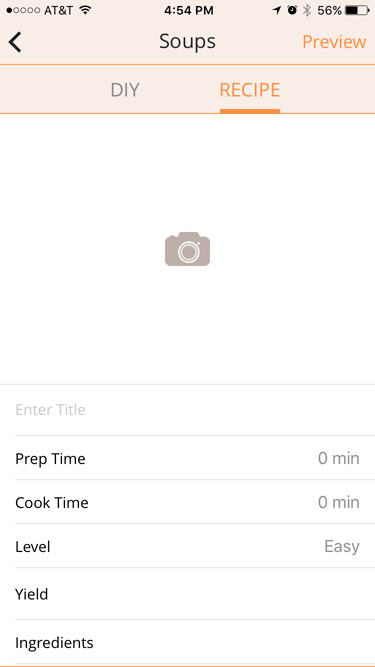
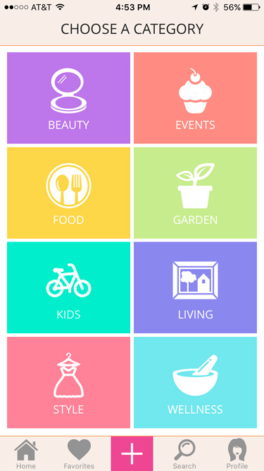
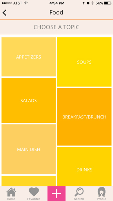
The visual design used color palette suitable for the target audience. The goal was to create a simple and usable design to create an engaging experience. Here are some of the visuals of the final product. If you are interested to know more about the App, you can download the same from the App Store and show us your support.